
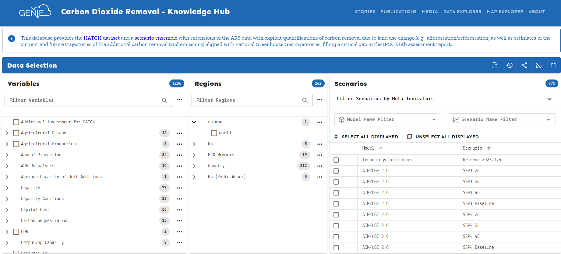
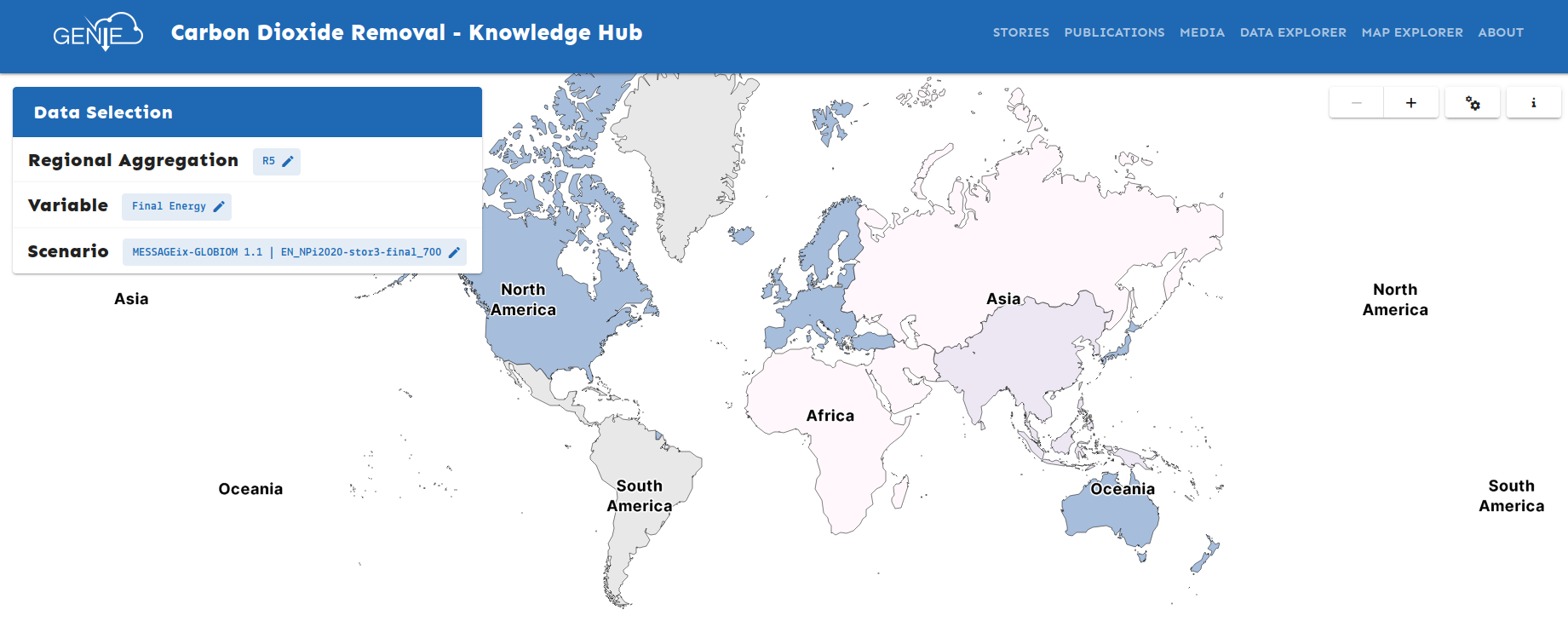
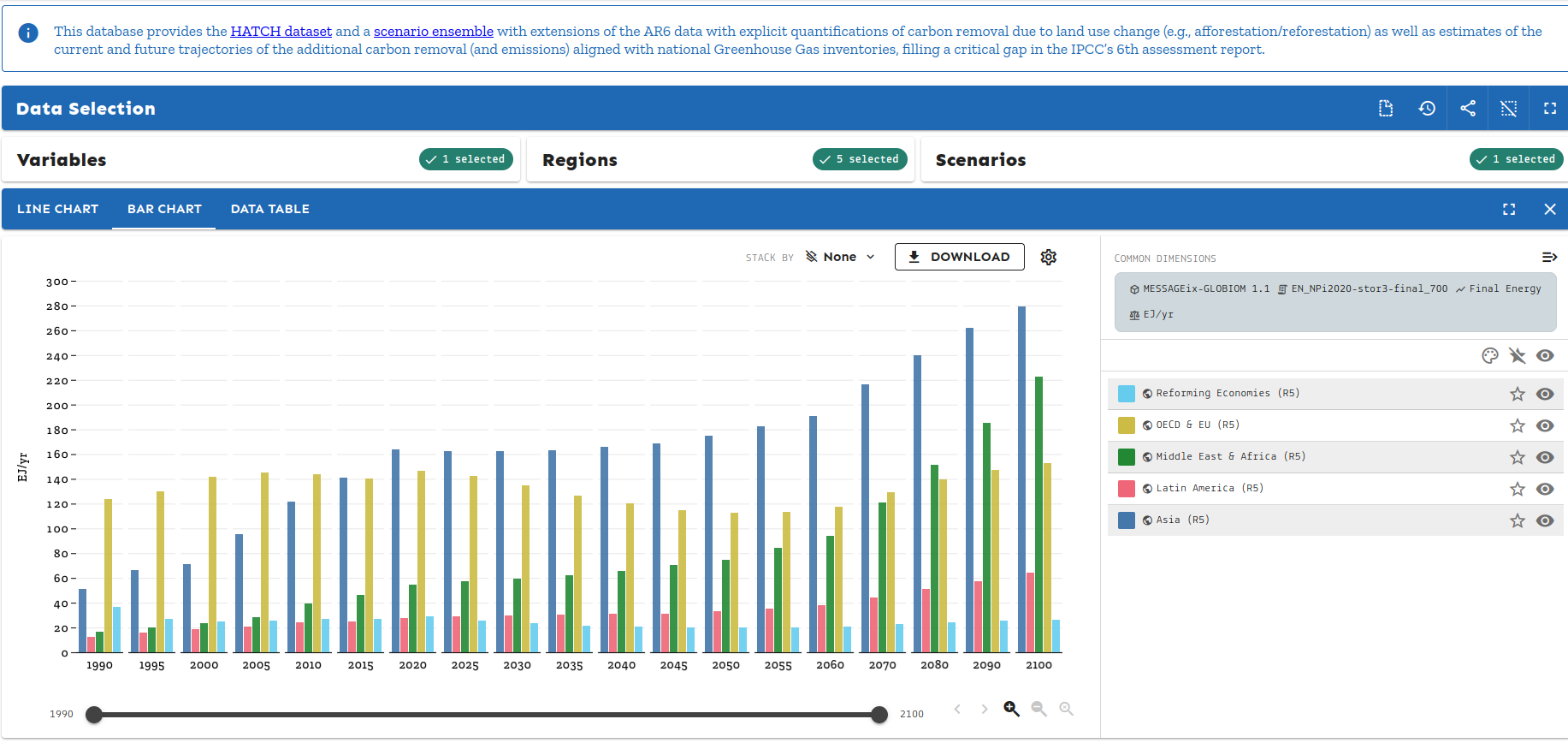
Dear GENIE colleagues, I would like to share an update on some of the new features that the Scenario Services team at IIASA has recently implemented in the Scenario Explorer front-end, which are now also available in the CDR Knowledge hub. As shared last year we added a data explorer to the CDR Knowledge hub to visualize the scenarios data. [cid:6550682a-1dad-428a-8a62-7c3dec901e7e] We now support native model regions and have added a map explorer to visualize the time-series data on a map. Below is an example of the R5 regions visualized. [cid:1128aaa3-b5a7-45cb-bfec-d4e370b04d47] In addition, the chart legend and mouse-over information in the data explorer plots have been made more user-friendly. You can now choose between multiple stacking options, customize colors, and use a highlight-dataset feature to easily identify specific time series. [cid:ec59f508-9a88-48ba-b4c8-d2c4524d42da] Please feel free to share any comments or suggestions for further improvements. Best regards, Lisah
participants (1)
-
 LIGONO Lisah